Black Gold Studios
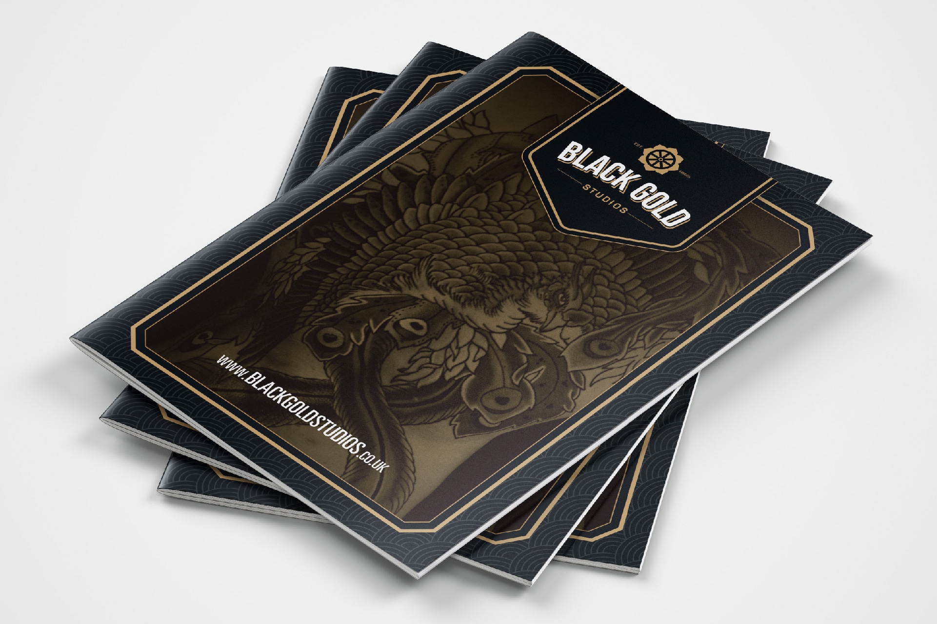
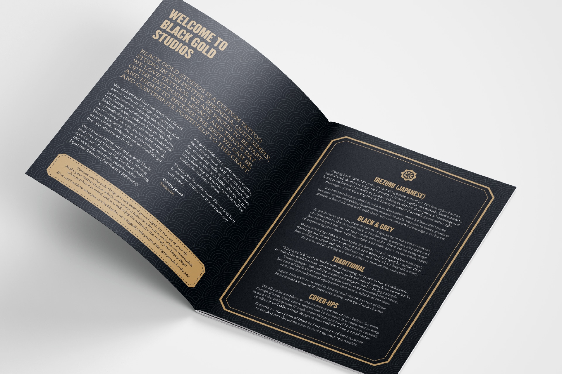
Branding for the Rhondda-based tattoo studio, Black Gold. The studio’s name derives from the affectionate term given to coal during the highs of the coal mining industry here in South Wales, while also having connotations to black ink, commonly used in tattooing. We also wanted the logo to represent something about the founder’s passion for Japanese culture and history; immersing himself in the stories of re-birth and Buddhism often depicted in Japanese art and tattoos whilst living there.
The result was a geometric roundel, depicting an eight-spoked coal mine wheel, echoing the studio’s name and local history, whilst also symbolising the noble eightfold path of Buddhism, all contained within a lotus flower – a symbol of peace and love, offset with traditional style typography.
ClientBlack Gold StudiosServicesDesign, Branding, Print


